TRIPO
“Tripo,” is a travel planner app that streamlines planning, encourages spontaneous adventures, and provides real-time support to handle any travel changes for a stress-free journey.
About The Project

Date:
Jan 2023 - Sep 2024
Project Type:
Individual Project
Focus Field:
User Experience, Visual Design, Prototyping, User Testing
Tools:
Figma, Framer, Adobe Creative Suite
0.1 - CONTEXT
0.2 - USER RESEARCH
Growing up, I loved organizing family trips, but juggling plans across multiple platforms often felt chaotic and overwhelming. One day, a friend and I decided to team up to create an app that would simplify the entire process and make it more enjoyable for everyone.
A competitor analysis was conducted, evaluating four key brands to determine TRIPO's market positioning. This assessment deepened the understanding of the competitive landscape, highlighted TRIPO's strengths and opportunities, and refined the strategic approach.
0.3 - INSIGHTS & PROBLEMS
The survey received 43 responses, and interviews were conducted with 10 individuals, ranging in age from 18 to 50.
0.4 - DESIGN CHALLENGE & OPPORTUNITY
How can we create a centralized platform that streamlines the trip-planning process, making it easier for users to navigate, organize, and manage their travel details without going through multiple platforms ?
0.5 - COMPETITOR ANALYSIS
24
People expressed a desire for an app that can recommend plans based on their preferences and needs.
Participant A Feedback - "It would be nice to have an app that designs a personalized plan based on my preferences and budget!"
50%
People expressed that they were somewhat or greatly annoyed by the different platforms they had to navigate.
Participant B Feedback - "I find it frustrating to search multiple websites to gather all the information I need for my plans "
To better understand what travelers need in an app, I conducted a survey and a series of interviews with participants around the Vancouver area. The survey included 10 thoughtfully designed questions aimed at exploring user preferences, pain points, and expectations. By combining the survey results with insights from the interviews, I gained a deeper understanding of travelers' experiences and requirements.


0.6 - SOLUTION

By creating an app that centralizes everything a traveler needs, TRIPO simplifies trip planning & makes navigating locations more efficient and stress-free.
Once the onboarding process is complete, TRIPO will provide personalized recommendations for places and activities based on the location you selected. These suggestions are tailored to your preferences, ensuring they align with your interests and travel goals.
You can easily add these recommendations to your itinerary, allowing you to effortlessly organize your plans and make the most of your trip. Whether you’re looking for local attractions, hidden gems, or unique experiences, TRIPO helps you craft an itinerary that’s perfectly suited to your journey.
Home Feed + Schedule
When you first onboard the app, TRIPO will guide you through a brief yet intuitive setup process by asking six key questions. These questions are designed to gather the essential information needed to personalize your experience, including accurate location and time settings.
By collecting this data upfront, TRIPO ensures that your app experience is fine-tuned from the very start, providing you with the most relevant and timely information for your travels. This thoughtful setup helps maximize convenience, allowing you to dive into your trip with ease and confidence.
Onboarding Journey
For the app's branding, we want to create a visual identity that feels distinctly modern and sleek, embodying simplicity, sophistication, and contemporary aesthetics. The design should emphasize clean lines, minimalist layouts, and an intuitive interface, ensuring it resonates with a forward-thinking audience.
For the font selection, we have chosen to use two typefaces: DM Serif Display for headings, to convey elegance and sophistication, and Be Vietnam Pro for body text, ensuring readability and a clean, professional look.
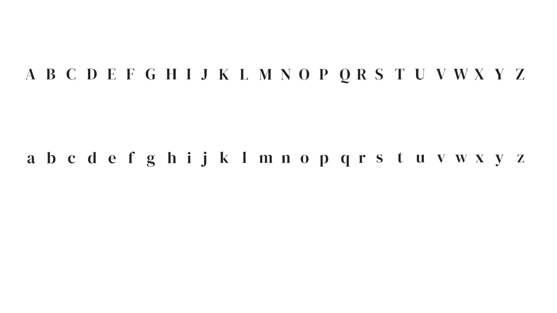
DM Serif Display:
Be Vietnam Pro:
For the app's color palette, we aim to use neutral tones for both primary and secondary colors. This choice creates a clean, modern aesthetic while ensuring the design remains versatile and visually appealing. We want to use the colour of the nature pallet
Primary Colours:
0.7 - VISUAL BRANDING AND IDENTITY
Typeface
Colour Palette
GREEN
Hex #94B280
RGB 148, 178, 128
CMYK 17,0,28,30
Pantone 7494C
WHITE
Hex ##FFFFFF
RGB 255,255,255
CMYK 0,0,0,0
Pantone 663 C


BLACK
Hex #000000
RGB 0, 0, 0
CMYK 0,0,0,100
Pantone 0961 C
GREY
Hex #EAEAEA
RGB 234, 234, 234
CMYK 0,0,0,8
Pantone 663 C
Designing this travel app to centralize information underscored the significance of incorporating localized insights, real-time updates, and a user-centered approach. Tailoring content to specific regions and providing accurate, timely data proved essential in enhancing user engagement and ensuring better preparedness. These elements were key in creating a more relevant and responsive experience for travelers.
0.8 - REFLECTION
@myquyenong